Behind The Work: Logo Design For Mount Patisserie
- Ricardo Tejeda

- Jul 12, 2022
- 3 min read
Updated: Oct 21, 2022
Behind The Work is an in-depth exploration of the thought process and reasoning - good and bad - that goes into some of our favorite projects.
We were recently contracted to create a logo for our friend, Austin Whitty, and her new company, Mount Patisserie. We decided to make Mount Patisserie our first feature on Behind the Work - a blog that dives deep into the work we're creating at Show and Tale Creative.
Mount Patisserie is an independently owned pastry company based in Asheville, North Carolina. The owner and operator, Austin Whitty, is a friend of Show And Tale, so we were more than happy to work with Austin on her logo. Our initial exchange began with logo designs Austin was inspired by. From that point, we built a foundation that consisted of more focused conversations, and we gained a solid understanding of the direction Mount Patisserie's logo would take.
To Austin's credit - whether realized or not - her vision matched our design sensibilities very well. The realization that a minimal, type-driven wordmark was the best route felt natural and mutual. The challenge would present itself when minimalist ideas merged with the classical pastry chef brand aesthetic. Creating a logo identity for a pastry chef in the mountains of western North Carolina that feels recognizable, inviting, contemporary, and unique was a little bit of a thought exercise.
The Rejections
Sugar Mountain
Our first design incorporated what I think are some of the more modern principles of minimalism - a layered abstraction of cake-based pastries with a sans serif typeface.

A strong symbol with depth and dimension was necessary for this particular design. The modern aesthetic of using minimalist shapes to represent a three-layered cake meant that color choice was vital for the symbol to be easily recognizable when standing on its own. This made for a design that felt interesting and different from other pastry chef logos.

Elegant Dessert
The next iteration of Mount Patisserie's logo paid homage to a more traditional look found in many pastry chef logos while remaining unique and contemporary.

This variation of the Mount Patiserrie logo borrows ideas from the first version by incorporating the concept of a layered cake but comes with a more classical and elegant feel, with the graphic symbol representing icing swirls. A script font that followed the flow of the icing emblem allowed them to naturally blend and made the entire logo feel connected. The modern aesthetic of the typeface adds a bit of fun and levity that is inviting to customers.

The Approved Design
The Wheat Sun
With all the logo variations, the goal was to provide a design that didn't feel like a typical pastry chef or baker's logo while fully representing Mount Patisserie's values and Austin's personality. The logo design we ultimately chose best checks these boxes and more.

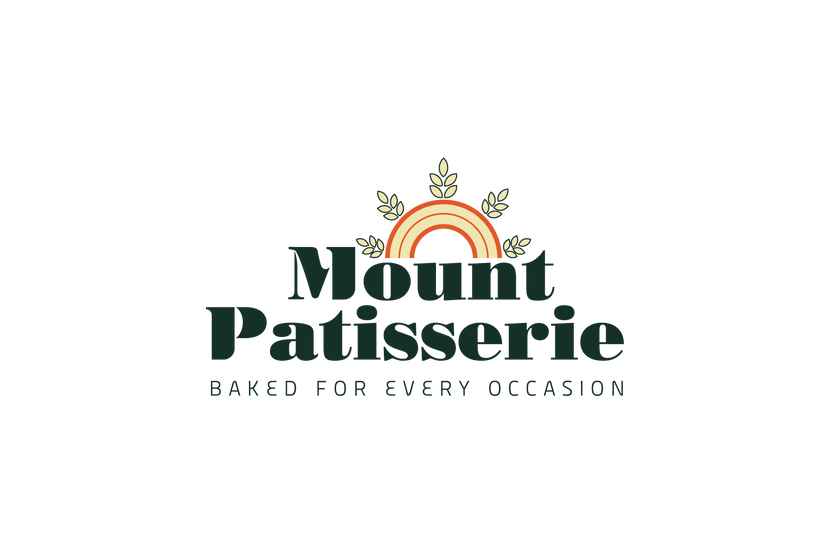

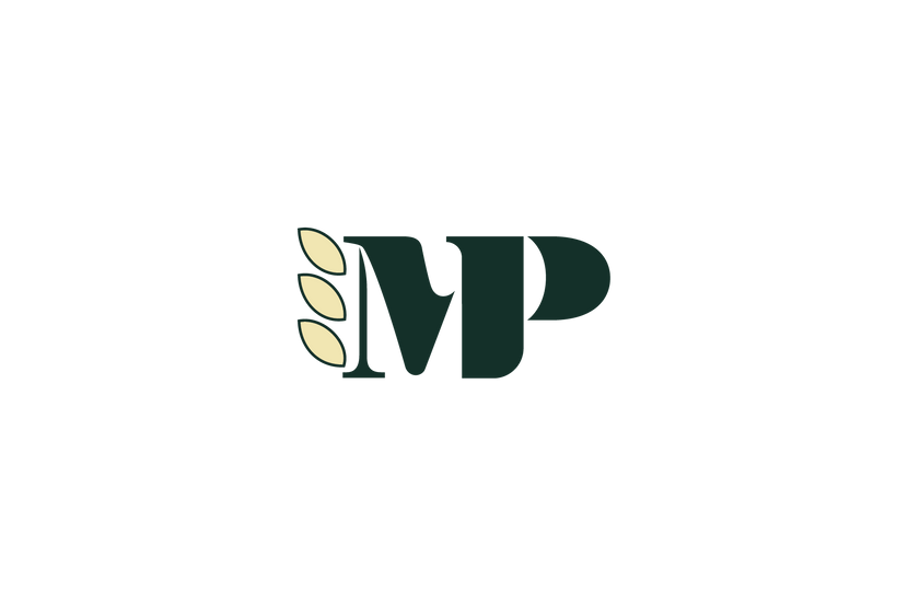


The approved design for Mount Patisserie's logo is made with a focus on type. Using a bold serif font as its wordmark, elements of the M and P were customized to distinguish the logo. The tagline is in a thin sans serif font that sits nicely with the bold company name. Everything is tied together by a minimalist representation of a sun peeking over the mountains with rays of wheat which gives meaning not only to the name, Mount Patisserie but also to the main component of flour and the sun it needs to grow.
I wanted to pay homage to the traditional charm of pastry chef and bakery identities while modernizing the design and making the logo stand out from what's typically seen online. Using a dynamic, mid-century modern color palette for a bright and inviting feel helped achieve the desired effect. The color palette represents Austin's personality and the tantalizing desserts of Mount Patisserie while perfectly complementing the overall design and maintaining the quality of professionalism and excellence you should expect.
The design naturally offers multiple variations to be used for an assortment of different platforms and mediums. The M and P work intrinsically to create an effective monogram, and the sun symbol can be altered to produce distinct interpretations. These two elements were combined to yield dynamic results, one of which was used to render a simple animation as an example of this logo's diversity. After a couple of versions that missed the mark and some thoughtful revisions, we have a strong, versatile, and fun logo that's sophisticated and, at the same time, approachable.
Client Thoughts
"Ricky, I love it! I love the wheat as a the sun rays! And the multiple iterations to be used in different applications! I think I am leaning more towards the single color design. I like the black and the rust color that is on the stamp sample picture. Thank you so much for making this for me! I appreciate your time and effort that has gone into it!" - Austin Whitty, owner and operator of Mount Patisserie


tỷ lệ kèo nhà cái dạo này thấy mọi người bàn nhiều quá nên mình cũng ghé thử một trang tổng hợp cho biết. Vừa vào đã thấy cái tiêu đề “Chào Mừng Đến Website Của Chúng Tôi” đặt ngay đầu nên khá dễ nắm họ định làm gì, kiểu chia sẻ thông tin cho người mới đọc cũng không bị ngợp. Mình thích nhất là cách họ chia nội dung thành mấy khối rõ ràng, kéo xuống mượt, không bị nhồi chữ dày đặc. Có vài ô dạng “Review Visit” xếp gọn gàng như danh sách, nhìn phát là biết chỗ nào là phần tóm tắt để bấm xem thêm nếu cần. Nói chung lướt nhanh vẫn hiểu bố…